Visualizing Canadian Wind Energy Data
Below are a sample of color schemes that were created and considered when developing the Wind Energy in Canada interactive visualization for GE Canada.
The Canadian wind energy landscape presents many challenges in securing a positive image amongst its people. This undue criticism filters downwards and occupies the technically innovative space where wind turbine manufacturers are situated. Global leaders and innovators in this space could benefit from captivating an audience using beautiful geovisualization that better explain the technologies driving renewable energy generation in Canada.
Data visualizations typically focus on telling a particular narrative for a particular audience. The art of captivating an audience larger than the predetermined specialists in the field relies heavily on presenting the data visualization in a beautiful manner. In this respect, geovisualizations are the perfect alternative to traditional data visualizations because they present a particular narrative framed by a geographic context.
The project was a collaboration with Michael Markieta.
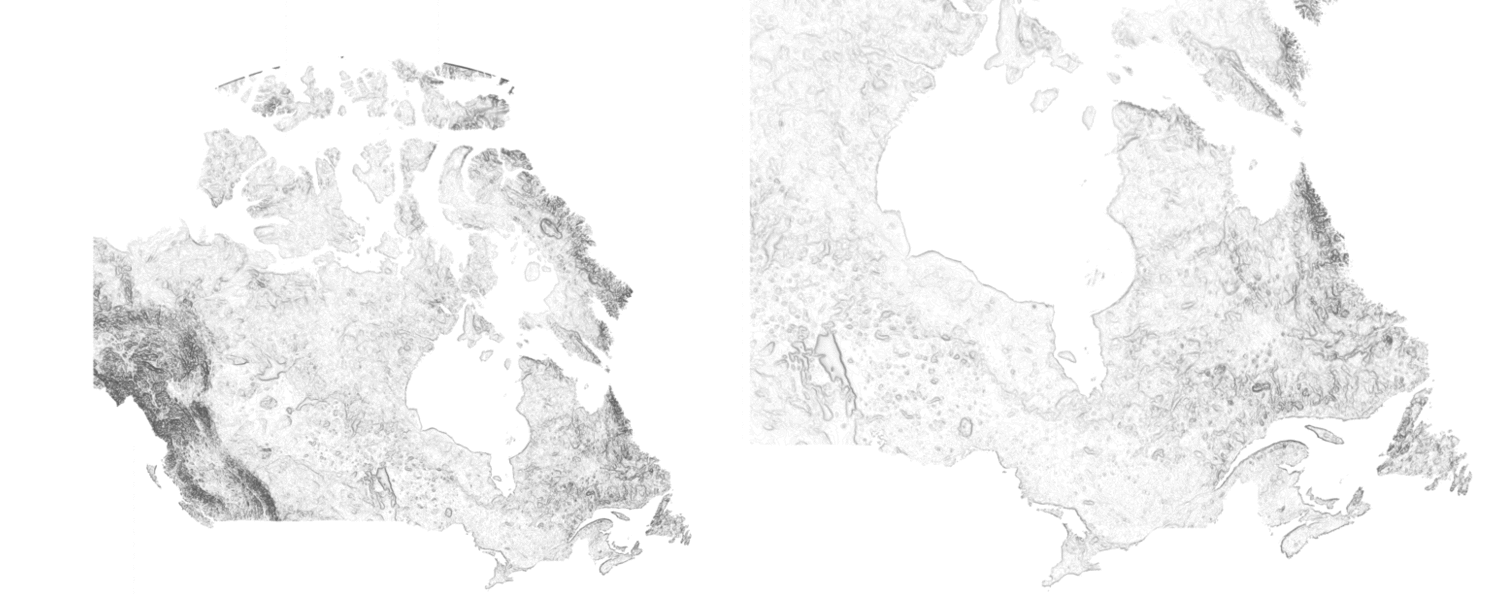
Sample Color Schemes - Animated Loop GIF
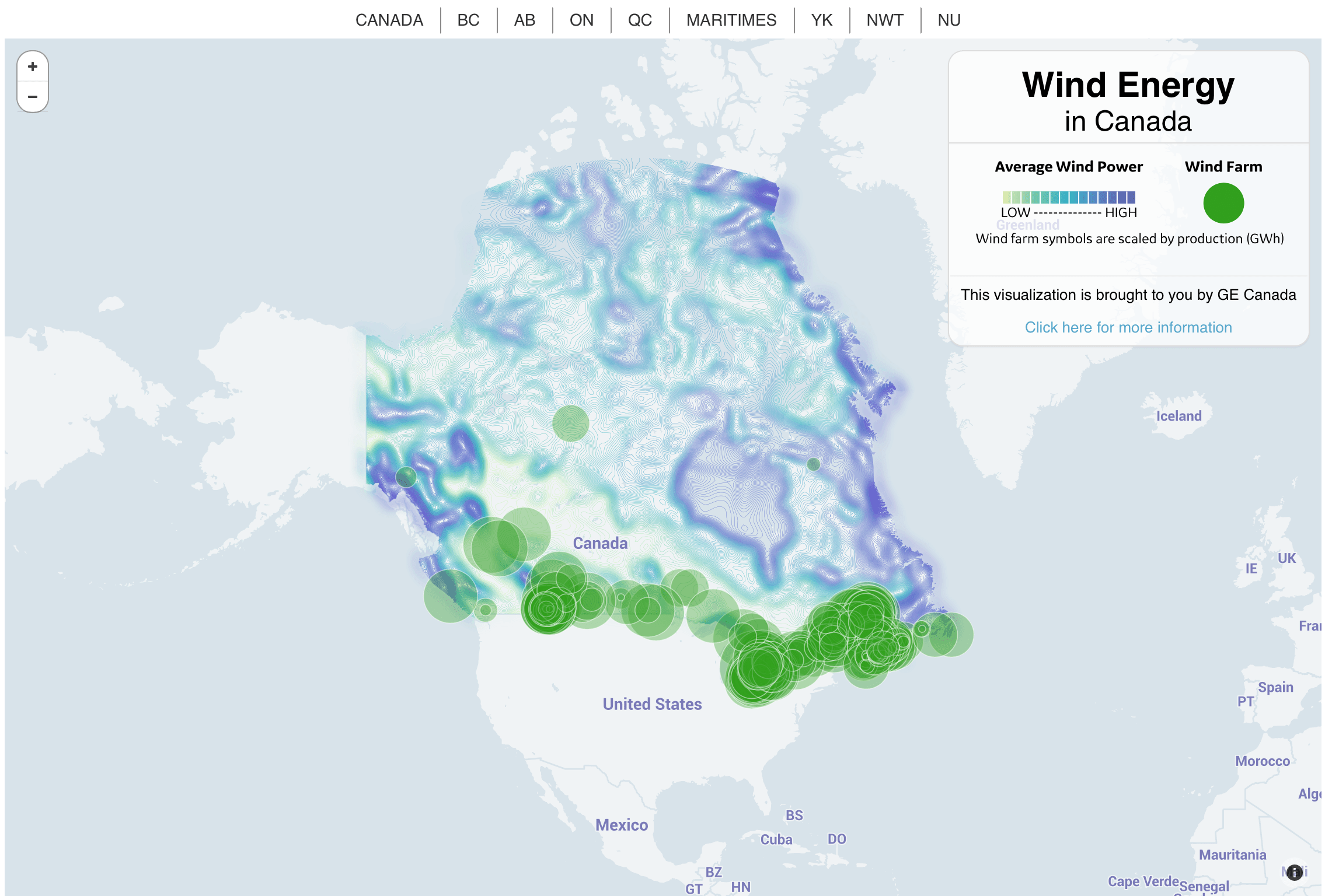
Final Map
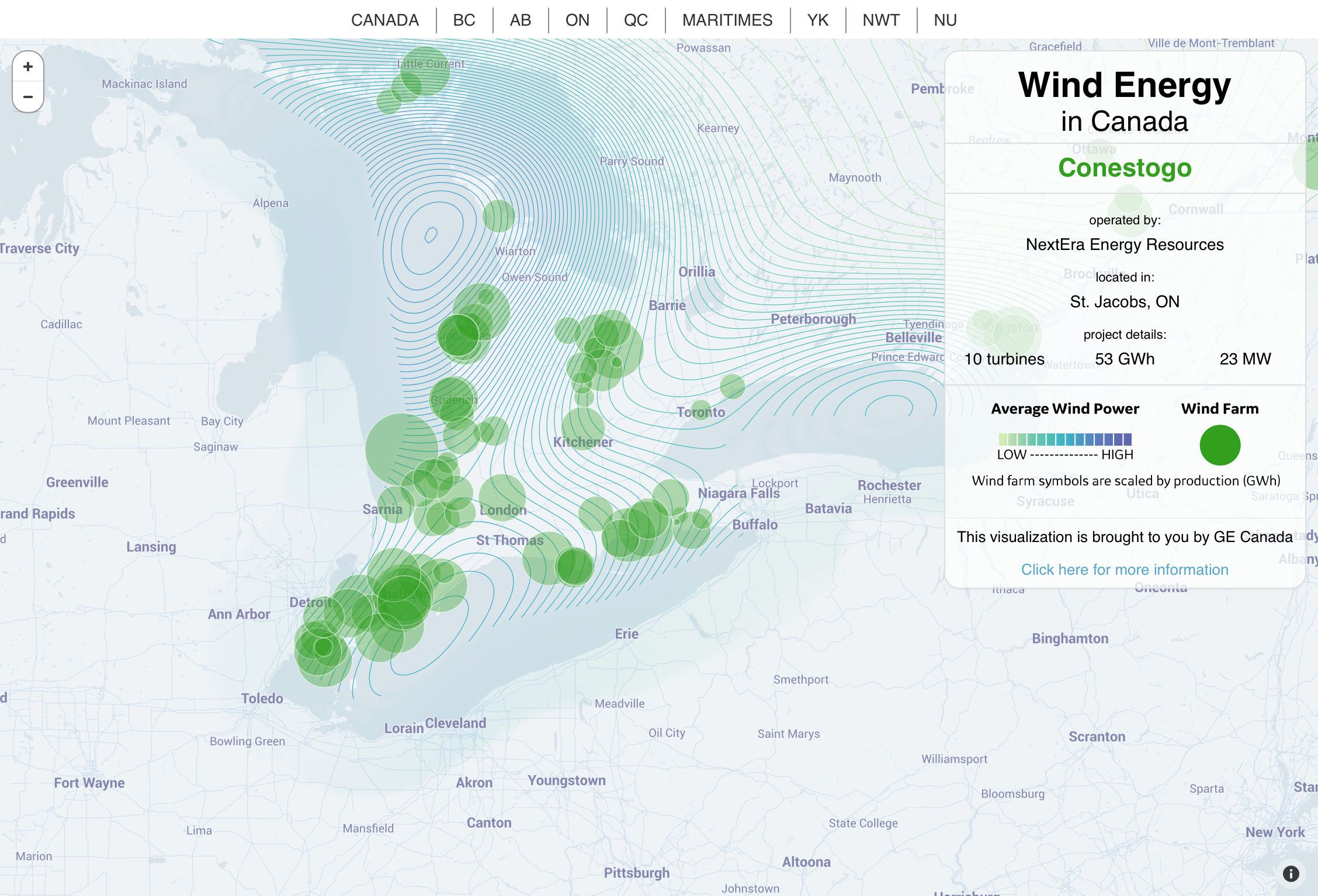
Final Map - Callout